A new logo for the Friends of the Library
Libraries are heaven and vice versa
If, as Borges said, “I have always imagined that Paradise will be a kind of library,” some of us have been fortunate to get a good preview here on terra firma.
From the Public Library of Cincinnati and Hamilton County, when I was a kid, to the Vernon R. Alden Library at Ohio University when I was a pupil, to the Alexandria Library today, I’ve enjoyed the incredible privilege of belonging to more than my share of these Elysia. We must do everything we can to give back.
So when the Friends of the Barrett Library, our neighborhood branch in Old Town, announced a competition to design a new logo, I made a beeline for the Creative Cloud app and downloaded the 7-day free trial of Adobe Illustrator. The task: get from the initial scribble-scrabble sketch concepts to something that could look at least plausible alongside the other entrants.
Also: learn to use Adobe Illustrator.
Visualizing the Friendship
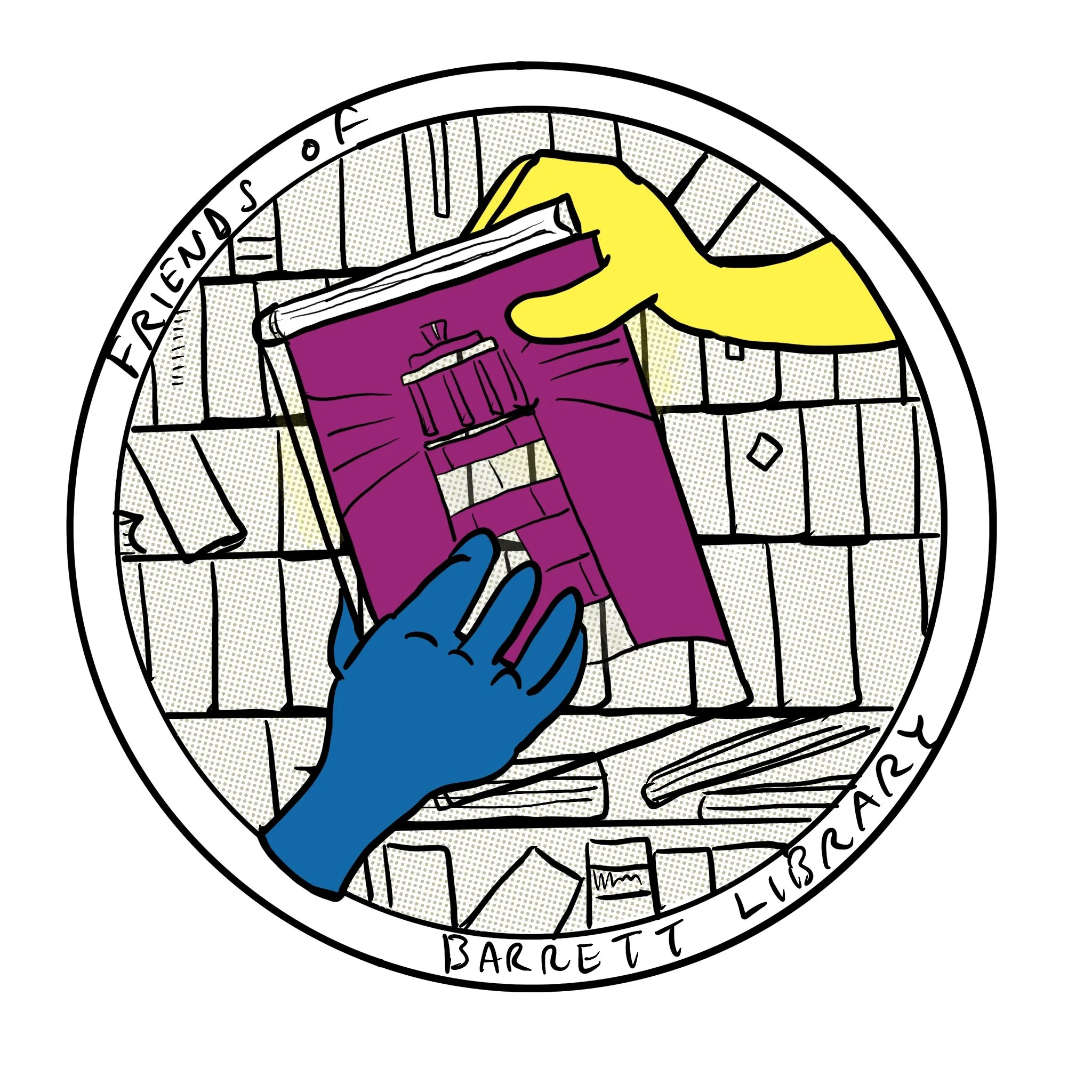
The existing Friends logo was the point of departure: it was a planar graphic of two hands, above and below, the icon of a book — like something that might have appeared on a knight’s shield in Chaucer. But I liked the idea of bounding whatever the new design would be in a unified shape, like the D.C. Comics “bullet” logo, and including the Friends’ wordmark as opposed to requiring it to appear separately from the graphic.
One thing the previous Friends logo didn’t do was depict anything about the Barrett Library itself or our home in the great City of Alexandria. So the initial concept for a new graphic included the elements of the old one — the hands, a book — bound in a roundel but with the Lighthouse of Alexandria beaming out some beamy beams for a whole, y’know, library-light-beams thing. This would appear against a back layer of volumes on a shelf.

Version 0 sketch.
No. Way too busy.
Version 0.95 sketch
And it would struggle to scale down — the challenge with a logo is that it’s got to work on a lapel pin, or printed on the side of a hand sanitizer bottle, just as well as if it were blown up to become the header on stationery or be painted on the side of a boxcar. (Happily not a use case for the Friends of the Library but the principle still applies.) Permanent credit: Aaron Draplin.
OK — what if the logo keeps the hands with the book but loses the “shelf of volumes” back layer? Ehhhh … also no — now the graphic is simpler but there’s not enough in it. How could the inner aspect of the graphic be simple enough to scale but fill up the whole space?

V 1 draft but still no.
The Library of Alexandria
What if the place-specific element literally depicted the library itself? The Kate Waller Barrett Library isn’t only special because it’s a library. It’s also a landmark in the battle for justice and equality: when the original structure was built in 1937, segregation was in full force. Black Alexandrians were barred from Borges’ paradise.
Two years later, lawyer Samuel Tucker and his colleagues took direct aim at this iniquity with a sit-in that challenged the Alexandria Library’s whites-only practices. Although it would take years finally to bring down the whole rotten edifice, Barrett Library is where the hammer blow struck. We remember that.
So let’s make the building itself the center of this shape. To do that I captured a few snaps of the facade on my phone and then used Lightroom to lightly clean it up: I erased the power lines out front, the paper signs on the doors and so on — evidence that it’s a working building in use every day. Let’s turn it into a quasi old-timey architectural elevation of itself … that way the whole shootin’ match also can be black and white, for a whole “print on the page,” “it’s like something out of a book” thing.
The photo went into an app called Adobe Capture, which can turn a photograph into a vector, an illustration not built out of pixels but fancy design math. This means it can scale down or up as much as needed without losing resolution like a photo … at least theoretically.
In went the first take.

V2 draft.
Erica and Elise liked the concept but not this execution, which did what we needed — it’s a triangle and rectangles inside a circle — but felt too on the nose. So the last version captures the facade from a different angle and farther back, keeping some of the shapes but also incorporating the trees and fence to convey the library’s glorious location at the corner of Queen and Columbus Streets.
We’re friends to all libraries but the goal with this is to make especially clear that we’re Friends of This Specific Library.
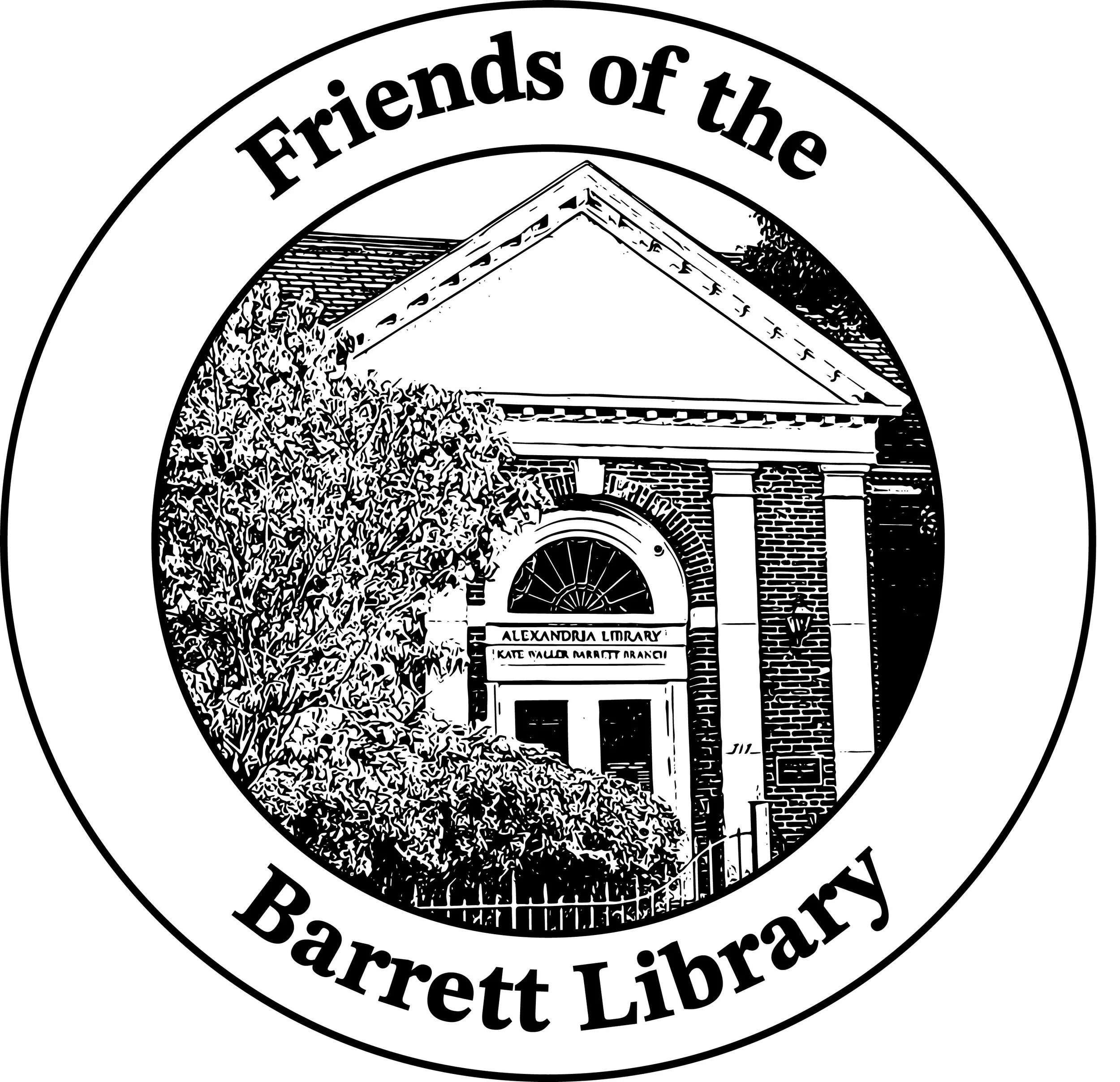
Final submission to the Friends.